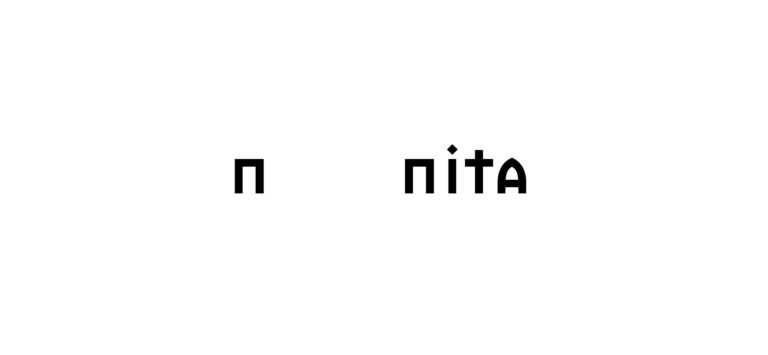
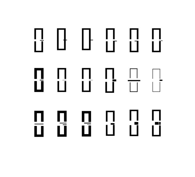
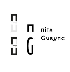
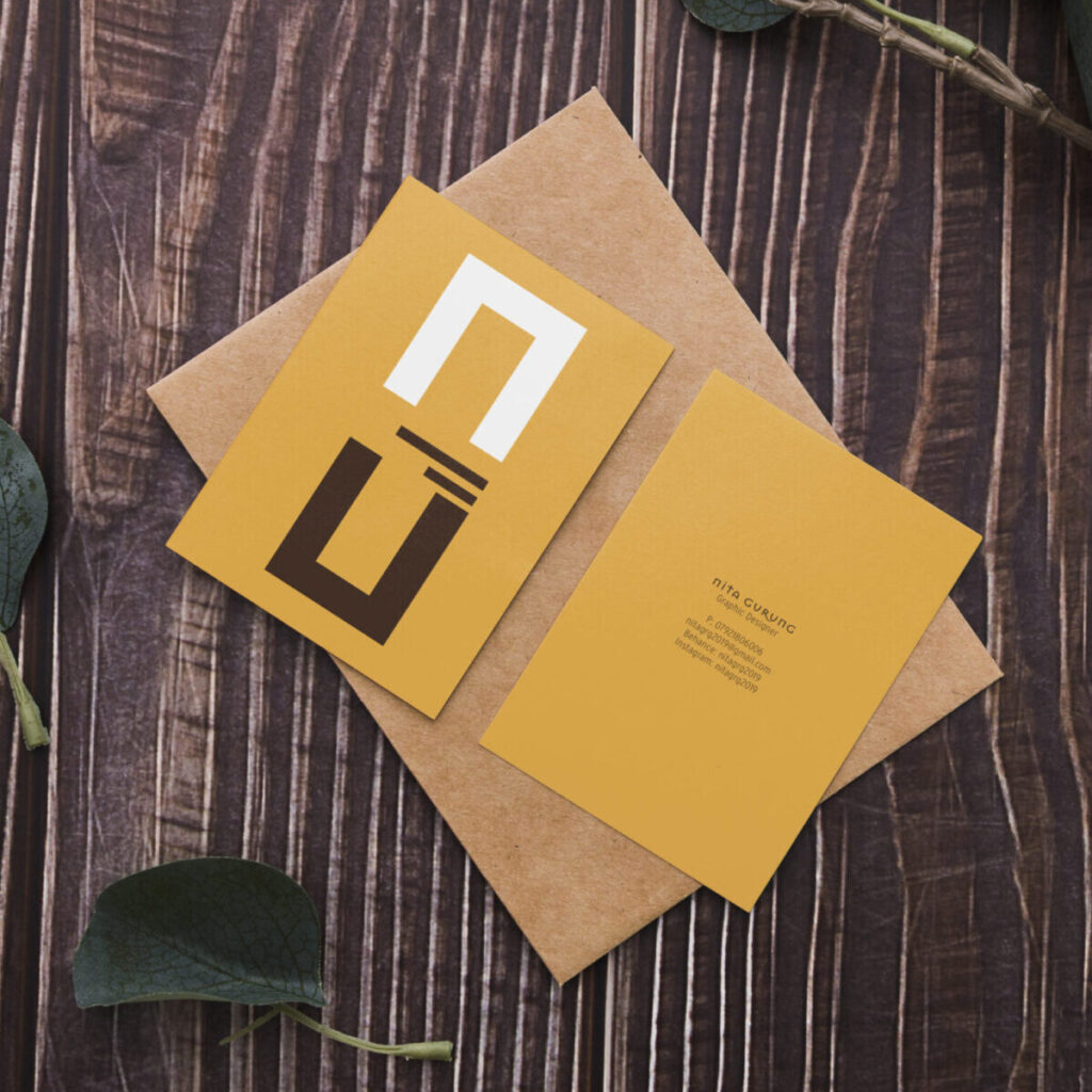
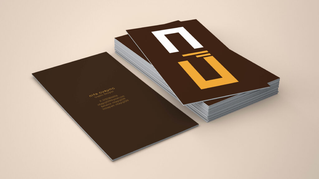
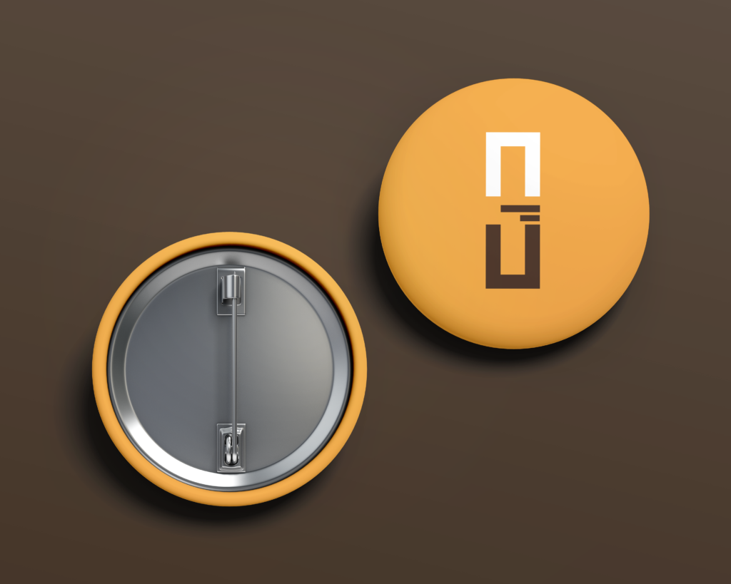
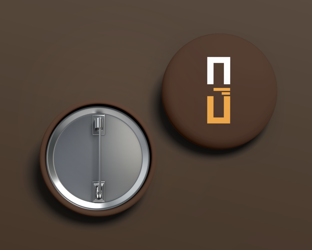
It started with writing the initial letter of my first name, ‘N’ employing the ‘Mason Sans OT’ font. Through a series of trials involving the arrangement of my initials, I eventually arrived at the ultimate visual design.
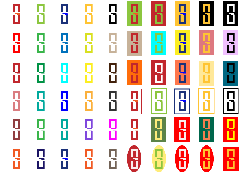
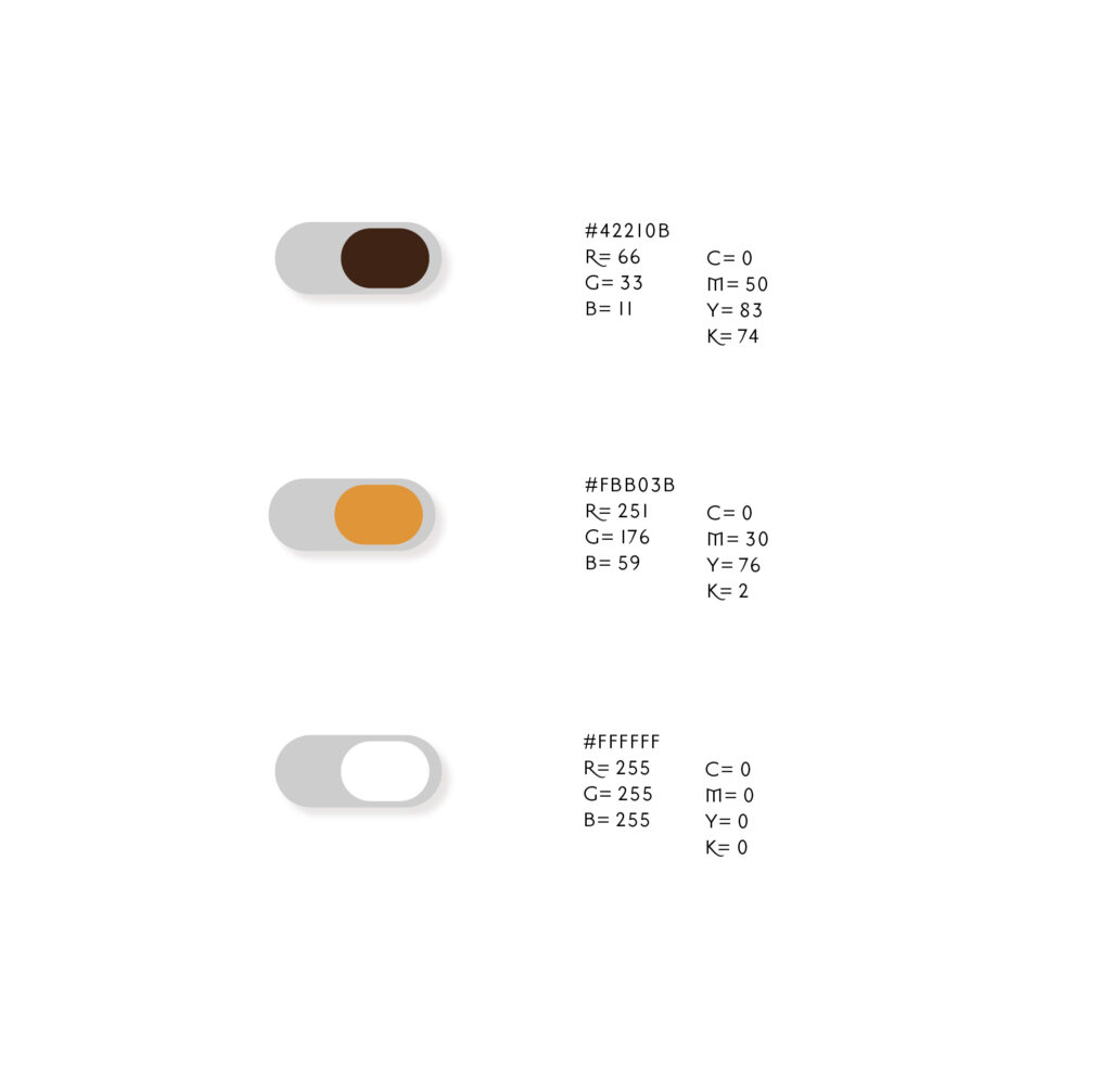
Selecting the perfect colour that accurately represents me was a crucial aspect of the process.
Brown serves as the symbol for chocolate, embodying my profound affection for it. I have a very sweet tooth.
Yellow is chosen to portray my cheerful nature and positive attitude towards life.
White serves to define my calm and composed nature.
I chose to incorporate straight and rigid lines into my logo to mirror my bold personality. This decision signifies a dedication to excellence, emphasizing a strict adherence to quality with no room for shortcuts or compromise in the final output of my work.